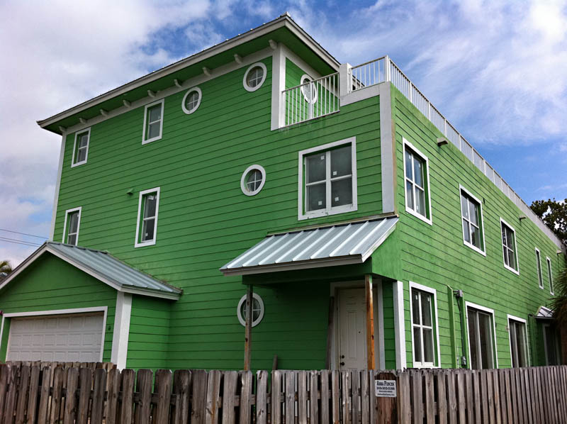
Thought I would share these two iPhone pics from the US earlier in the year to demonstrate the power that colour has on the ‘feel’ of an image… and how the images below are so different – just by changing the colour.
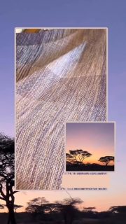
Why not try the same exercise that I did below, and choose an image and experiment with a monotone conversion… and compare the differences and ‘feel’ of the images when the element of colour is removed.
I found it realy interesting for me in the images below that I thought they seemed to be in a different position and at different angles – but they are exactly the same image… just with different colour – or lack of.










Sorry, the comment form is closed at this time.